Note: the demo in this video shows an older version of PowerBI, so your screen may look slightly different but the basics are the same.
Subscribe to our Youtube Channel here
Like podcasts? Find our full archive here or anywhere you listen to podcasts: search Community IT Innovators Nonprofit Technology Topics on Apple, Spotify, Google, Stitcher, Pandora, and more. Or ask your smart speaker.
Learn how your nonprofit can harness big data and business intelligence with Microsoft PowerBI.
Do you ever feel that processing and massaging your data is taking over your work life like kudzu?
Conversely, have you been ignoring data that you know you could use, because it would take forever to set up to start tracking it correctly?
Microsoft has made its Power BI suite available at an affordable price for nonprofit organizations. With minimal ramp-up, your organization can start to visualize and analyze your key data from all systems – including website and social media analytics, CRM, constituent communications platforms like Mailchimp and Constant Contact, and other data sources—in an easy-to-digest format.
In this webinar we review the capabilities (and limitations) of Microsoft PowerBI and how it can be used by nonprofits to better understand all types of data. Community IT Innovators is product agnostic – in this presentation we review without promoting adoption of Power BI, and share our experience to help you make an informed decision. If you are already using Office365 then PowerBI is an additional tool in the Microsoft suite that you may want to take a look at.
What is Power BI? From Microsoft: “Power BI enables everyone at every level of your organization to make confident decisions using up-to-the-minute analytics…It is a suite of business analytics tools that deliver insights throughout your organization. Connect to hundreds of data sources, simplify data prep, and drive ad hoc analysis. Produce beautiful reports, then publish them for your organization to consume on the web and across mobile devices. Everyone can create personalized dashboards with a unique, 360-degree view of their business. And scale across the enterprise, with governance and security built-in.. Keep your data secure with industry-leading data security capabilities including sensitivity labeling, end-to-end encryption, and real-time access monitoring.”

Johan Hammerstrom’s focus and expertise are in nonprofit IT leadership, governance practices, and nonprofit IT strategy. In addition to deep experience supporting hundreds of nonprofit clients for over 20 years, Johan has a technical background as a computer engineer and a strong servant-leadership style as the head of an employee-owned small service business. After advising and strategizing with nonprofit clients over the years, he has gained a wealth of insight into the budget and decision-making culture at nonprofits – a culture that enables creative IT management but can place constraints on strategies and implementation.
As CEO, Johan provides high-level direction and leadership in client partnerships. He also guides Community IT’s relationship to its Board and ESOP employee-owners. Johan is also instrumental in building a Community IT value of giving back to the sector by sharing resources and knowledge through free website materials, monthly webinars, and external speaking engagements.
Johan graduated with Honors and a BS in Chemistry from Stanford University and received a master’s degree in Biophysics from Johns Hopkins University.
Johan Hammerstrom: My name is Johan Hammerstrom, President and CEO, I’m actually the moderator. I’ve done every webinar for several years now. A little bit about us: Community IT is a 100% employee owned managed services provider.
We’re talking today about business intelligence. Business intelligence is the strategies and technologies used to conduct data analysis of business information. I turned this into a diagram that helped me think about the definition a little bit more clearly. Hopefully you’re all now seeing it. And then maybe the light bulb is going off for you as well.
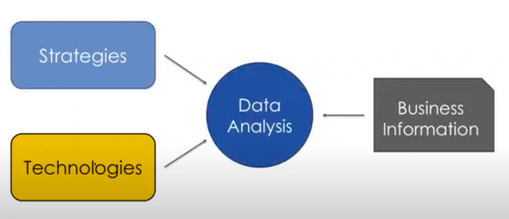
Business intelligence is really taking strategies for analyzing data, using technology to analyze that data and conducting that analysis on business information. And as we just learned, visualization is a key part of it. And this is one of the things that’s really new today because there’s a whole variety of tools now that are being developed to help organizations visualize large amounts of data.
And I think that’s really catalyzing a new era of data analysis for all sizes of organizations: large, medium, and small.
We’re talking about business intelligence, but we’re really going to talk about data visualization and how you and your organization can really gain a foothold on business intelligence through the power of data visualization.
There are a variety of platforms now that are available for conducting this analysis. And so Gartner, one of the foremost authorities on information systems, every year releases a wide variety of these types of magic quadrant diagrams, which basically take a certain solution
As with most of these types of diagrams, the farther up in the upper right-hand corner you are, the better off you’re doing.
The bottom axis is completeness of vision. The Y axis is ability to execute. They look at a variety of different software. Not everything in this diagram involves data visualization. This is the magic quadrant for analytics and business intelligence, but I think it’s notable that the three leaders Qlik, Tableau and Microsoft are all data visualization platforms.
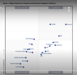
Some of the other ones here, like SAS for example, is a story package for doing data analysis. Obviously, they have a lot of data visualization tools, but you can do so much more. It’s a very powerful set of software that’s used by major statisticians and data analysis organizations.
Salesforce is a CRM that obviously in this case, they’re looking at it as a CRM or platform that can gather business information and then analyze that information.
But I think it’s notable that the top three, the three leaders, Tableau, Microsoft and Qlik are all first and foremost data visualization platforms for business intelligence.
I want to talk a little bit about the difference between Microsoft and Tableau, because those are really the top two players. Tableau is a more established leader in this space. Qlik is also a bit of a leader, I have less experience with that. I’ve used Tableau a little bit. I’ve used Power BI a lot, obviously.
If you’re familiar with Microsoft products, if you’ve used Excel, PowerPoint or Outlook, you’re going to be familiar with the user interface that Microsoft has created for Power BI. So there’s a very quick uptime to using the software.
I’ll talk a little bit about pricing for nonprofits in a minute, but it’s much less expensive than any of the other tools that are out there. And what’s interesting is that it’s got the most, the greatest completeness of vision and is on power with Tableau for ability to execute. So it’s pretty incredible actually that not only is it the absolute leader in this segment, but also probably the lowest priced option of anything on this graph.
Third and also importantly, and I’ll get into this in the final demo and section of the webinar,
So if your organization is on Office 365 right now, and using it, it’s going to work. I’ll show you. It’ll be much easier to just show you how it integrates, but it makes publishing things to the cloud a lot easier.
This is one of the big differences between Power BI and Tableau.
Tableau was really developed first and foremost as a desktop application. And so, they do have a Tableau in the cloud and they do have software as a service versions, but it feels like it was added on later. Whereas Power BI was really built with the cloud in mind first and foremost.
The integration with the cloud is really fantastic and I’ll do some demos and you can see how that works.
Some of the advantages of Tableau,
It never ceases to amaze me. The number of times I want to do something in Power BI that seems pretty easy and straightforward, whether it’s a formatting change, cleaning the data in a certain way, and I just can’t seem to be able to do it in the application. And I figure it’s me.
Then I go to the forums and I realize everyone’s having this problem. And then in four or five months, Microsoft releases an update that fixes it. So this is kind of the typical Microsoft release, improve, update, cycle where they release a product that maybe isn’t quite ready for prime time, but works well enough, and then over time they really polish it up and get it ready to work without any hitches or bugs or anything like that.
Tableau is that product. It’s ready. So if you start to use Power BI, just be aware that you may run into some funny display, formatting, other types of glitches or issues.
And I’ve found doing kind of side-by-side comparisons that the visualizations that you can create in Tableau look better than the visualizations that you can create in Power BI. Not significantly better, but it just looks like they’ve really focused on that in the development of their product.
Tableau is anywhere from, depending on how many people in your organization you want using these products, Tableau could be anywhere from 10 to 20, to a hundred times more expensive than Power BI. So it’s a significant increase in expense over Power BI.
But for some organizations, it may end up being a better solution. But I think if you’re just getting into business intelligence in your organization and data visualization, I couldn’t recommend Power BI enough as a way of getting to know the whole sector and what these products can do.
Then if down the road you feel like there’s something that power BI isn’t providing for you, you can always look at switching over to Tableau.
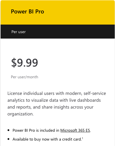
So this is literally the money slide. This is the game changer in my view and something that Microsoft continues to do really well. Microsoft’s reputation as a company has kind of waxed and waned and waxes again right now, as a technology company, but their commitment to the non-profit sector has been solid for the last 20 – 25 years.
[The price in 2021 is now $9.99 per user/month]
And the key thing to know is that this is for Power BI Pro. If you have Office 365 right now, E1, E2, E3, you can download the Power BI desktop and start using it on your own, just regular Power BI, at no additional charge.
And then if you want to end up sharing reports with other people, if you want some of the more advanced Office 365 integration, that’s when you start paying the $3 per user, per month. But if you have two or three people in your organization that want to do data analysis and they want to create reports and share them with each other for $9 a month, $6 – 9 a month, you provide them with this incredible platform for doing that. It’s so inexpensive that they’re practically giving it away, in my view. (See https://powerbi.microsoft.com/en-us/pricing/)
So that’s why we’re really going to focus in this webinar on Power BI. We’re really going to look at how Power BI can be combined with strategies to do data analysis on business information. More than anything else, and maybe this is a disclaimer that I should have made at the outset, I don’t have a background in data analysis, not formally, and I don’t have a background in data visualization. I have done a lot of it over the years in the course of running Community IT, and in the course of providing service for our nonprofit clients, but I’m presenting this from a lay person’s perspective.
My attitude about it really is that these tools are so easy to use that if you’ve used Excel, for example, to create a pivot table or create a chart, and a lot of people do that.They don’t have a background in data analysis, but they’re interested in doing some analysis on their business information. And so they pull it into Excel and they create charts and maybe even pivot tables, if you’ve been doing that, Power BI is really a way of taking that to the next level. Power BI is something that professionals can use, but it’s also something that people who are coming from a financial background or an IT Management background or a program background; they can use this tool as well to conduct data analysis.
It can also be used for more formal and advanced strategies.
What kind of business information can you pull into Power BI?
There’s really no limit if you have a database with data. By database, I mean any kind of information system that’s storing data, whether it’s a spreadsheet, a CSV file or an actual database. You can pull that information into Power BI and start to analyze it.
So you could look at
You’ll connect to Google Analytics. So you can use Power BI instead of the Google Analytics interface, to look at your
Anything you can think of is valid for business information for Power BI.
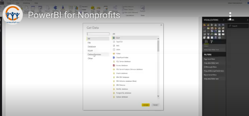
So the first step in the process of using Power BI for business intelligence is to build it. You have to build the report. So as I mentioned just now, you can take information from almost anywhere and put it into Power BI, and I’m going to do a demo in just a minute, but you see here a quick screenshot from the Power BI desktop application.
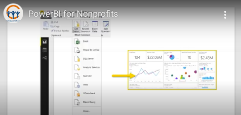
And these are the default or the first options that you get: connect to an Excel Spreadsheet, connect to a Power BIservice that someone has set up, if you have a SQL database, you can connect to that.
These are sort of generic connectors, but Microsoft also includes more specific connectors. So here you see that there’s a variety of databases that Power BI supports. So ones that I’ve never heard of, some that maybe you’ve heard of, or not. Chances are, if you’re using a major database, it shows up here.
If it’s not, if it doesn’t show up here, they actually have generic connectors that you can use as well.
Microsoft has a long reputation for being very proprietary, but with Office 365, we’ve found that they’ve become a lot more ecumenical and they’re really sort of pulling in others. They’re realizing that they have to connect to everything.
So you see on this list, they connect to Amazon Redshift. They actually connect to a wide variety of Amazon web services. And then you see here, there’s a whole number of online services that you can connect into your Power BI, whether it’s Salesforce. Google Analytics, I had mentioned before. Facebook, MailChimp is on here. So if you want to do data and create some custom reports on if you’re using MailChimp for your emailing you can do that with Power BI.
So it’s really extensive the number of integrations that are provided.
I see a couple of questions coming in and since I’m flying this ship solo today, I will get to those questions at the end. So I appreciate them as the questions come up, please go ahead and send them in through the chat channel. And then we’ll definitely have time at the end of the webinar today to go through those questions. All right.
Let’s start with our first demo. I’m going to show how you can use Power BI to
So here I am in my demo environment, I think you can all see that. And this is generic data that I got from Microsoft, and it’s basically sales of different kinds of bicycles to different countries, number of bicycles sold. So it’s just a spreadsheet, just a basic spreadsheet. And then I added a tab here just to show you. I don’t know if these classifications are correct or not. I just made a few up just to show how we can connect these two tables in Power BI.
So this is Power BI. You can download it. If you have Office 365, you can download the desktop application and install it. I think it only runs on Windows, I don’t think it’s available on the Mac yet. But like I said before, you don’t need a Power BI pro license to install and use the Power BI desktop application. If you have Office 365, I believe you just go to app.powerbi.com and you can get started today. All right.
So we’re going to go ahead and load the data and we do that right here. This is the window that I was showing you before second here to load up. There we go.
Okay. And I’m just going to show off for a second. All of the different online services that I was showing you before: GitHub, any developers out there, QuickBooks online, you moved it, Smartsheet if you’re using that to manage your projects. A lot of these you’ll see are beta and are still in development. And when you try to connect to one of these that’s a beta, it’ll tell you this is in beta. Buyer beware; you’ve been warned.
We’re just going to start at the top. And for me, I was using Excel to do a lot of analysis, internally at Community IT doing all pivot tables and charts. And it required a lot of manual work. Basically I’d have to export the data from different sources and reformat every time I brought it into a spreadsheet and then I had to rebuild the queries and stuff, and it just was taking a long time. And one of the things that Power BI really helped with was automating that process.
Once I got it set up the first time around and got the report and the data import exactly the way I wanted it, I could just save it. And then I’d never have to adjust that again. It kind of automated that and saved me a lot of time.
So I’m going to go in and connect to Excel spreadsheet. So this is the spreadsheet I was just showing you: March Webinar Demo. You can connect to a spreadsheet anywhere. Now, if it’s on your desktop obviously you have to be able to access that spreadsheet, but if you have Dropbox, Box, if you’ve got a spreadsheet in SharePoint, if you have it in your OneDrive, you can connect to it.
As long as you can get to that through the internet, you can set up a connection over the web. So once you publish this report, it’s now going over the internet to get to that spreadsheet rather than having to go to your local desktop or file server.
Actually this is on our SharePoint site. So in the future, if I wanted to adjust this data over time and pull it in over and over again, I would just create a link to that SharePoint site. I’m going to go ahead and open it up. and it’s connecting.
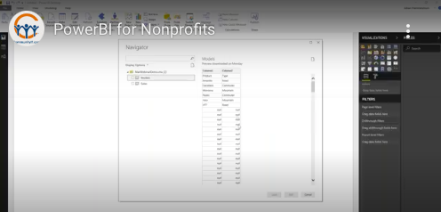
And so now it shows me the two tabs in the spreadsheet, everything is alphabetical. It doesn’t matter what order I have those tabs in, and I click on this. Okay, this could be trouble. We’re going to forge ahead. PowerBI can fix whatever it is that looks funky here. And then here’s the sales tab and I want to import both of them. Now you have the option when you set up your import to Excel spreadsheet of importing just one; you don’t have to import all of them. But in this case, I’m going to import all of them. So I’ll click on that, click on load, and the little wheels are going to start turning, creating the connection in the model. And once it’s done, you see these little icons over here.
These are your critical navigation tools through Power BI.
The top one is reports. The second one is the actual data that I’ve loaded. And the third one represents the connections between the data.
If you recall, I’ve got products and then I created this type of bicycle based on the product name. And that’s supposed to connect here to products in this table and in power BI I’d really like to connect these two. I can’t do it yet because this data is not clean, but once I clean the data up, I’ll be able to make that connection. So, yeah, as you can see, I got some problems with my data here, got all these blank values, not looking good. And that happens, right? You don’t always get clean data whether it’s connecting directly to a database or exporting the data from another source and Power BI is great at cleaning the data.
And so I’m going to go into the query editor right here. So I just click on this. And again, maybe I’m cheating in doing this. Back in the old days, you’d have to write some SQL query code. You’d have to have that background, that knowledge, that experience which I don’t have. But I do have experience with using these types of Microsoft platforms and they make it really easy.
It’s clear when I go into the query editor, that there’s a problem with all of these null values. I don’t want them in there. I want to clean them out. And it’s possible that there’s a command line that I could process the data through before importing it that would get rid of the null values, but there’s actually an easier way.
If I just click on this drop down menu here, I can unselect the null value and click okay. And now the null value is gone. It’s just gone.
Now, if you notice over here in applied steps, they’ve done all the heavy lifting for me. So they now have created a query automatically right here. You can see it up here at the top. It says basically “select the rows where the column value is not equal to null.” So that’s the logical expression that gets rid of the null for me. And it’s embedded here.
These applied steps are like a sequence of query commands that are cleaning the data for me. So if I actually go back to the previous step, that’s still there. So that’s a history of what’s being done to clean the data. And then I go back here and this shows me the source, and this is where I could enter in the link to a web based location rather than my desktop.
But let’s go back to the data the way we want it. There’s one other problem with this data. And that is the headers ended up in the first row. I don’t want it to be column one and column two. I want the headers to be product and type. Well, I think that’s a common problem because Microsoft gives you this option right here, “Use first row as headers.” And if I just click on that, it automatically makes the first row a header. And it records that here in my list of applied steps.
This is a pretty simple example, but you could imagine that you have all kinds of problems in your data that you want to clean up, or you want to add new columns based on the values and these columns.
For example if I go over here to my sales data, right here, I’ve got month name, month number. Maybe I want a column that just lists the day of the month. I could add that in here, and then that’s being done at a query level. So when the data is being pulled in, it’s automatically creating these new columns for me.
I’m just scratching the surface here. There’s an incredible amount of steps that you can add that really help to transform the data. And this is fast. This is a huge improvement over using Excel because once you’ve created those steps, every time you import the data, it’s automatically doing those transformations for you. You don’t have to do that every time you’re trying to run this report. So I’m going to click “close and apply,” and it’s applying the changes for me. And now I’m out of the query editor, and I’m back in my Power BI.
And now you can see my model is nice and clean, just like my sales data table. My model data table looks nice, thanks to the query. And if I go to the relationships, it’s automatically detected this relationship between product in this reference table and product in my data table. And I can just double click on that connection.
And I can see here, it’s made a mini to one relationship between these two tables. So it automatically detected that. If it hadn’t, I could have gone in and added it, but because the column labels were the same, they went ahead and made that assumption for me.
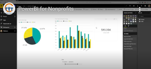
And that’s great because let’s say data that I didn’t have before was the number of mountain bikes that were sold in a given year. So I’m going to go ahead and create a pie chart, and I’m going to add that I want to know units sold. So I’m going to drag that over here into values, and then I want to divide that out based on the type of bike.
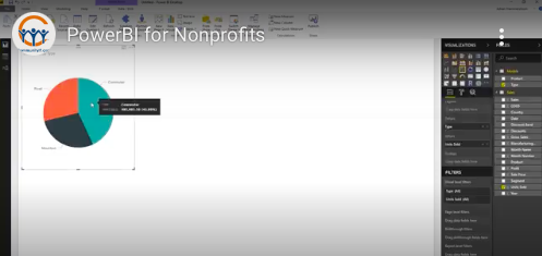
Let me go here to details. Now you can see, 43% of our sales were commuter bikes, 28% were mountain bikes, and 20% were road bikes.
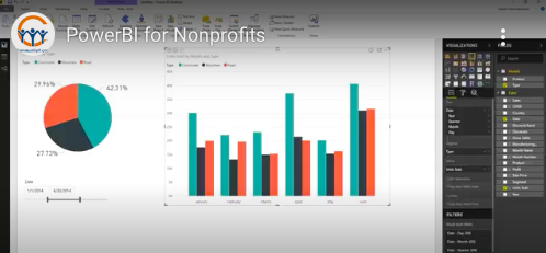
We can add another chart to this. So I’m going to go here and I want to see what the sales were like over time. So I’m going to do the same. the units sold as the value. I’m going to look at it based on the type, and then I’m going to break it out based on date.
Now, it’s showing me year over year. So obviously our sales went up nicely, but let’s say we want to look at it quarter by quarter. Power BI already figured that out for you. And if you go up here you just drill down, and now you’ve got a nice report by quarter, and you can see how things looked. You hover your mouse over the bar, and it shows you the total number of units sold. All right.
That was a basic introductory demo on how you can import data into Power BI. You can build some basic reports and you can create some interaction between different types of data pretty readily.
I’m going to take a quick pause and just check and make sure — all right, got some questions. I promise I will get to those at the end of the webinar, but I do want to get to the next demo. So we’ll come back to those questions.
So now we’ve created the visualization. The next step is exploring the data, and one of the things that I’ve personally experienced and also seen with other organizations that use Power BI is that once you start presenting data to people in a visual format, they start to ask questions, “Oh, wait a second. Okay. I never realized that the number of recipients of our newsletter did this at this time of year. Is that for all of our newsletters?” And then the questions start to come, and then you can start to modify your reports to try to answer those questions, because that’s really one of the major goals of business intelligence is analyzing your data to help provide more information, more understanding of the different forces that are affecting your organization’s business.
In the next demo, I want to dive into this question of visualization in more detail.
I don’t know if we’ll have time for that, but I’ve got some fancy reports I can show you just to kind of illustrate the power of Power BI.
So let’s head back over to our Windows environment and talk a little bit about interactive data. So one of the things you can do with Power BI is select data and it conveys across all of the reports on a page.
So I just want to check on commuter bikes. As soon as I collect commuter bikes, then I’m certainly seeing just the commuter bikes, everything else is sort of grayed out. You can have interactive elements in your report. This is okay, but it’s not really helping me because I have to hover on the report to see what the percentages are. So I’m going to go over here to format and I can add data labels. With the legend on, I’m going to do percent of total. Under data labels, I switched to percent of total. So now you see the legend here for the different types, and then you can see the percent of total, and I want to make it a little bit bigger, so you can see what it looks like there.
Now, they have these things in Power BI called slicers, which can also be helpful. So I’m going to click on my slicer right here. Let’s start with “country.” I’m going to make the slicer country. So these are the different countries that we’re selling our bicycles in, but let’s say you’re wanting to create a report for the VP of sales in Mexico. He or she is only interested in the sales from Mexico. All you have to do is click on this and now it’s filtered out everything except for your sales in Mexico. You see that commuter bikes are 44% in Mexico, 43%. So Mexico is pretty similar to the total sales. And let’s say, you just want to go through and see it for each country. That’s all pretty much the same.
You can add a different type of slicer. Let’s say you want to look at the date, so you can add your date right there. And you’re really only interested in all of this information for the first half of 2014. So I’m just going to go ahead and slide this up to January. Then pull this back to the end of June. And now you’ve got those two and I can drill down a little bit more. And now I see each month. Let’s say I don’t like these, like the 2014, I just want the dates. You can drill down this way. And it just takes you straight into the months. That also gives you the option to do a year over year or yearly total analysis, if you’re just looking at that. So there’s kind of this nice sort of interactivity here.
You can also use Power BI to create key performance indicators. I’m just going to go ahead and rather than try to build a new page, I’ll just do that here. So we’ve got right here, a key performance indicators tool. That’s just a card and we want to look at the total number of units sold. So now you can slide through and you can see total number of units sold in a given period of time. So your slicer changes the value that shows up here. You can click there and now, okay. I just want to see total number of commuter bikes sold over this period of time. I want to see total number of road bikes sold. So you can create reports that have that sort of information. Let me see if I can pull up my fancy sample report.
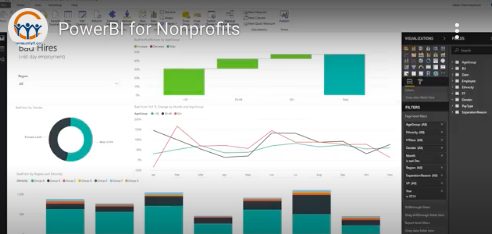
This is a human resources sample report. You can download it from Microsoft and they’ve created a scorecard here. So this is just an example of the kind of thing that if you get really advanced, you can do with Power BI. These are all the vice-presidents in the organization. You can pick one. So this is an example of a report that you would build in Power BI. Obviously, this took a lot of work to get to this point and then it’s formatted for a mobile device. So this is something that you publish to Office 365 and then people — VPs, for example, could access it using the Power BI app on their iPhone or Android phone.
Just giving credit where credit is due, this came from obviEnce and it was made available on the Microsoft site. And then here’s just an example of some of the things you can do. You can create these dashboards where you’re looking at the number of hires. This is obviously, working on a lot of data, a complex amount of data.
All right, so that’s a quick intro to formatting, getting fancy, etcetera, etcetera.
What’s next? It’s publishing the data. I alluded to that on the previous Power BI reports. They had that one report that was very clearly formatted for a mobile device.
One of the things that really distinguishes Power BI from other data visualization tools is the ease with which you can publish information to the web and share it with other people.
This schematic gives us an overview of how that’s done. So we’ve been so far in our demos simply using the Power BI desktop. Once you get the report set up the way that you want it, you can actually publish it to the Power BI service which is accessed through the web and is part of Office 365. And once you do that, then you can access it through the Power BI mobile app, which is available on mobile devices.
Basically, the Power BI desktop can connect to over 50 applications. You can publish those reports to the Power BI service. You can set up special Power BI gateways to organizational data. So if you wanted to warehouse your data you could do that and then you can access those web-based reports through a browser or through mobile devices.
So let’s do the demo and I’ll show you a little bit about how that works. This is going away from our fancy Human Resources, and we’re going to go back to our really basic bicycle sales data.
Let’s say I’ve been working on this report. I’ve brought key stakeholders in, I showed them the report and they’re like, “Well, I’d really rather see this. I’d like to see that,” you know, the head of the road bike division, doesn’t like the color red, because it looks dangerous. We don’t want people to think that our road bikes are dangerous. Okay. Okay. Got it. How about orange? Okay. Yeah. Orange. That’s it. Well, that doesn’t look very good. Let’s go with yellow, right? Bright, happy, we’re out there enjoying the sunshine on our road bike. And we want to change this one as well.
This is a silly little example, but it just gives you a sense of how easy it is to format these things. And again, the real value here is that once you’ve made the change, next time I import the data, it’s all just pulling me right into this template that I’ve already created. All right. So everything looks good, and we’ve got everyone sort of onboard with this setup for the report. We want to go ahead and publish it to the web because many of the key stakeholders, executives, they’re not going to want to run Power BI desktop on their windows machine.
If they have a Mac, they can’t run it. They just want to go to a website where the data is so that they can analyze it and take a look at it. So go here to publish and you’ll see yes, I’ll go ahead and save my changes.
I’ll just save webinar demo two, I had another one pre-baked just in case. All right.
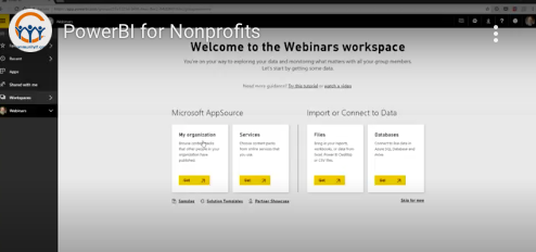
So where do I want to publish it? I’ve got a number of workspaces. I’ve got one here for webinars. So actually, let me show you what that looks like. So this is the Power BI Office 365 interface right now and I’ve got a number of workspaces. Those actually integrate with Office 365 groups. So if you have created groups for your organization, every group has a power BI workspace already available to it.
So for example, if you created a group for your FHA, for your finance and human resources, and administration group, and they’re sharing files in the group space, and they’re using the OneNote notebook and they want to look at Power BI reports, you can just publish those reports to that group’s workspace. And everybody who’s in that group will automatically have access to it.
Now, the catch is that it requires a Power BI pro license. And so anyone who wants to look at these reports live in the web space will need a Power BI pro license and they’ll need to be logged in, in order to access it. So right now, we don’t have anything and I skip that for now. Don’t have any dashboards, don’t have any reports. We don’t have any workbooks. We don’t have any data. This webinar’s group is completely empty, but we’re about to change that. So I’m going to go ahead and select webinars to publish my information to, and so it’s publishing webinar demo to Power BI, give that a second.
All right. So it’s all published. Now, the key thing to remember is that it’s not synchronized, it’s just published. So if I go in and start changing the data here, let’s say, I get rid of this. It’s gone, and I changed this slider. Those changes are not going to be reflected on this new webinar demo two, but now I published it. It was ready instantaneously. Your data sets are ready. You want to see it.
The data set is actually the data itself. Those data tables that I showed you before that were associated with the Power BI desktop app, those have been published as have the reports. So I’m going to go ahead and click here and you can see that report that I had created. And obviously the changes I just made aren’t reflected here because I published it prior to making those changes.
That report that I just made is here. And now I can share that report with anyone else with a Power BI pro in my organization who wants to see it.
And there’s some other cool things that you can do in the web interface. It’s still interactive. So you can still do that. You can create dashboards. I’m clicking on that in the visual, I’m going to create a sales dashboard.
So now when I go back out to webinars, I’ve got my sales dashboard here and that just shows me that one report. If I click on it, it takes me into the report itself. And I see the chart there. They like to remind you about a lot of things.
Another thing you can do is you can actually edit the report on the web. So this looks similar to what we were just looking at. It’s not as powerful. It’s actually, for those of you who are used to the Office web apps, it’s maybe a closer approximation of the desktop app than the Office web apps like Excel Online or Word Online.
It still lacks the full functionality, but you can do some things. Let’s go back to my trivial example, the yellow color just isn’t working. Nobody likes it. We’re going to switch to purple. You can make that change here on the web app, just as you would have on the desktop application and all other kinds of advanced changes, and you can add new graphs. You can switch the graph type. So this is a traditional graph, let’s say clustered column. Let’s say we want a stacked column. So click here, boom, we’ve got the stacked column and that’s good. That’s the way we want it. We’re going to save this report.
You can do some other things from the web version that you can’t do in other places, such as embedding it in SharePoint online. So if you have a SharePoint intranet that you use or people use the SharePoint site as an intranet, you can embed these reports directly into that site.
You can also export it to PowerPoint. So if I clicked on that, this would basically spit out a PowerPoint presentation with however many pages I had in this Power BI report in PowerPoint.
And let’s say, someone shared this with me and I really want to dive into it on my desktop. I can go and download a copy of the report and open it in the Power BI desktop app. So those are all things you can do and then I’ve saved it.
So I’m gonna switch it back to the reading view, and then I’m gonna come back to here. This is just a quick overview. There’s a ton of other features and functionality. Once you publish things to the Office 365, you can create, you can kind of go full circle and basically create an ODBC connection in an Excel spreadsheet back to this dataset. And so now you’ve got the data the way you want it. You can actually now go back to where you started from using Excell to analyze that data.
I’m not going to get into that today. You can also publish it to what they call apps. The naming convention is a little confusing. It’s not really an app in the mobile sense of the term, but it does show up a little more easily in the actual Power BI mobile app.
So that’s an easy way to publish that one dashboard chart that people want to look at. All right, I think that was everything on the sharing demo that I was going to cover. I want to leave time, we have a lot of questions.
Are you interested? Is this something that you want to explore more? Do you kind of want to take it for a test drive? What do you do to learn more about Power BI? Microsoft has made a number of tutorials available at powerbi.microsoft.com.
You can just Google Power BI tutorial. And I think this is the first link that comes up. They have some great videos. They have some great guides for doing some basic things in Power BI. I’ve found that it’s a little frustrating at first, but once you spend a couple hours with it, it really starts to flow and gets a lot easier.
Before we get to the questions, I want to thank everyone for joining us this afternoon for this overview of Power BI for nonprofits. I did want to highlight next month’s webinar. It’s going to be Wednesday, April 18th, the third Wednesday of the month at 04:00. Our chief technology officer Matthew Eshleman will be just back from New Orleans where he will be attending the 18th Nonprofit Technology Conference and will be presenting actually with one of our clients, a session on email encryption which is going to be really interesting. So if any of you are concerned about email security, you want to make sure that nobody and I mean, nobody has access to your email. This is a great session, and I’d encourage you to go check it out.
I encourage you to sign up for April’s webinar. Matt’s going to be providing us with his Roundup from the 18th NTC. I’m not able to go this year. I’m looking forward to that webinar. And I encourage any of you who do attend or aren’t able to go to join us for that webinar as well.
All right, well, let’s move on to some questions and a lot of questions about not being able to see the slides. Again, I apologize for that.
Qlik products: the Qlik company is Qlik and the product is QlikView https://www.qlik.com/us/products/qlikview. So QlikView is a data visualization product. I have very little experience with it, so I don’t feel I can speak to it too much.
How difficult is it to combine data from multiple sources into one report?
It’s very easy. It’s actually really simple. Going back to the desktop here really quickly, I’ve created this one report. I could now get additional data from a different source and feed it into this. I can just go here and add data from another source. When I add data from that source it is just going to show up as a new data table. (49:28) So let’s say you have a SQL connection, you have a SQL database. You just go here and you put in SQL server, you’d enter the authentication credentials, and then it would bring up that loading window. And at that window you would pick which tables you wanted to import. And those would just show up here.
So once the table is imported into the Power BI, the PBIX file, you can combine that and it just shows up here and you can put multiple data sources on a single report. The bigger challenge is linking the data. And if you don’t have some sort of unique identifier connecting fields between two different data tables from different sources, that could be a bigger challenge. But if you have that, then from the standpoint of using the application, it’s very straightforward.
You use Office 365, but you’re using Macs?
Everything I showed you, you can do in the web interface. So let me go back to the web interface here. So you can create a new report, a new dataset. You could create any dataset. You could import a file, like an Excel file. You could connect to a live database, that can be done through the web. You could also, once you import that data set, you could create a new report from an existing data set and pick your data set or import your data.
Realistically you could do everything that you can do with the desktop version through the web interface. It’s not going to be as pleasant. I actually have a Mac and for a variety of reasons, I use Parallels. That’s what I’m running this Windows 10 desktop on, not just for Power BI. I have tried creating reports and importing data and cleaning the data and everything in the web interface. And it can be done, but it’s not altogether pleasant. It’s more challenging. I’ll just put it that way.
How do I transfer ownership or add a new owner of the report tried to share with my pro subscription and the intended recipient can only view the report?
They also have to have a pro license. So that’s really kind of the downside with Power BI. That’s the evil genius of Microsoft coming through. You can create and share reports, but they also have to have a Power BI license. And I believe they have to be in your organization as well or federated through AzureAD, if you have that. Now, the one exception is you can publish data publicly and share it with anyone and actually, I’ve seen this. Organizations who just want to share their information publicly, they’ll create the report in Power BI and then they’ll create basically a public link and embed that in their website.
Nowadays you’ll run into interactive infographics on a lot of sites. And oftentimes it’s pretty obvious, “Oh, this was created with Power BI.” So that’s the one exception, but that’s really for public interest type work. In most cases, you’re not going to want to share your information with the world.
How much setup do you do versus when you hand over to non-IT data staff for them to update/create themselves?
That’s a great question. And I think it really varies based on the technical proficiency of the non-IT staff. If they are data staff, if they’re data analysts, then other than getting the software installed on their system and getting all the workspaces and everything set up, once you show them how to import the data, they’re probably good to go in terms of figuring out the application for cleaning the data.
For more executive staff you probably need to more or less publish the data for them, schedule a meeting. Use the meeting to run through the report for them, and then work backwards from there. Give them access to the website and see if it’s something they want to go in and work with.
But I guess maybe to better answer your question, once this is all set up, it doesn’t need to be set up again. So let’s say I had used a SQL database instead of an Excel spreadsheet to pull these data tables. It would update; just hit refresh and it would requeary that database every time that you opened it and you wouldn’t really need to do any of this stuff that you were doing. The query editor, all of that, that’s all saved now. All of this stuff is saved and they could start to refresh the data and start to analyze it. So that sort of framework doesn’t need to be set up again.
Can you apply more than one slicer at a time? (54:52)
Yes. I believe you can put another slicer on here and we’ll do country this time. So now, we’ve got Mexico in 2014 and you can do Mexico and France in 2014. You can also, if you don’t want the slicers, say, you’re just creating a report for the VP of sales in Canada. This whole thing is just for her and she doesn’t want to see any of the other stuff. You can create these report level filters here. I can come down, bring the country there, just pick Canada. And now every page on this report is going to be just Canada.
Or, I’m going to make this one Canada and then move it up and I just have to recreate it as a country page level filter. Now this page is Canada and I’ll duplicate the page and then I’ll make this page Mexico. And now everything on this page is Mexico and then you can rinse and repeat. You can do that for all of the pages. And you can insert visuals pretty quickly. So you could put the country flag up here. So it’s visually pretty similar.
Do users have to log into Office 365 online to see the reports?
They do. They do have to log in online.
How do you keep the data updated? Can you link it to the source data so that it gets updated daily or on an interval that you select?
Great question. So I was using the spreadsheet because it was an easy example, but let’s just say I had an SQL database, an ODBC connection to a SQL database instead, if on the desktop version, when I hit refresh, it’ll just refresh it for me. On the web version, you go to datasets and you click that refresh button there and it refreshes it. Now this isn’t going to work because if you recall, I had this connected to a spreadsheet on my desktop, so it’s not going to work.
But what you can do is go to settings and you can schedule a refresh. So I can change the source to a SQL database. I can have it refresh automatically. This is another feature that is not available if you don’t have Power BI pro. And I think it’s restricted to a day with Power BI pro, and it can be done continuously or more frequently with Power BI premium, which is more expensive. But you can set up a schedule refresh. You can set up alerts, I don’t have any, but you can set it up to email people when the reports are done. So let’s say you want the data to refresh on a weekly basis and the report will be updated and you want an email to go out to key stakeholders. You can set that up here. And all of that kind of happens behind the scenes.
Is there a way to make this much bigger?
I don’t know if that refers to the GoToMeeting screen share, or if that refers to Power BI. So yeah, I’ve struggled with the same thing. I’m on a 24 inch monitor right now. And I feel like this is just about the smallest I’d want to go to work with Power BI. I’ve tried to do it on my desktop and it gets really tiny, really quick. This is one of those things where you can switch to actual size fit to page. This is one of those things where Microsoft isn’t quite fully baked. Maybe I’m missing it, but I don’t know if there’s a zoom feature on this to zoom it in. That’s something that’s missing. So, no, there isn’t really a way to make it bigger. Although I may be missing something obvious as far as that goes.
Can it be done on an iPad iOS?
I know that you can see the reports in iOS. I haven’t tried modifying them on the mobile app, so I don’t know if it’s possible or not. That’s a great question. I’ll have to look at it.
Follow-up from the earlier question about adding a new order, trying to share with pro subscription and the intended recipient can only view the report. I think that is a limitation of the system. So thank you for your follow-up. He replied that they do have a pro subscription but they still can’t edit. So that’s a good question. I think that might be a limitation as well. I could be wrong about that, but that could be a limitation.
A follow-up on the automatic updates suggestion was made. Could you add something that showed you the last time the report was updated?
That’s a good idea. It does tell you. I thought it said on here when it was last updated and seeing that now, but the data set gives you that. Although you’re right, that’s a little wonky. It’d be nice to have that in the report itself. There’s probably a way, and I’m just not aware of it.
Well, we’ve gone a little bit over, but I appreciate everyone’s attention today. Thank you all for joining us for this webinar. As I mentioned before, the slides and recording will be published to our website and we look forward to you joining us next month. Have a great afternoon everyone, take care.
Wednesday July 23d at 3pm Eastern learn how to run this valuable training tool with Matt Eshleman, cybersecurity expert.
Fill out the form below to request a quote. We’ll be in touch shortly to discuss your needs and take the first step toward better nonprofit IT.